Twin Creek Buffalo Co.
A local farm family had approached me about designing a new logo for their family business. The primary challenge was finding a solution that all family members could agree on. This meant many revisions and concept designs, but in the end they chose a design that was simple, yet spoke to them. Below is a sampling of some of the concept designs for the Twin Creek Buffalo Co. of Quill Lake, SK.

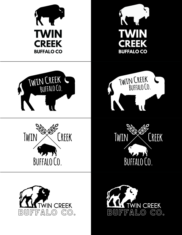
Original Concept Samples based on initial discussions. Something a bit on the more modern side, with still a vintage feel.

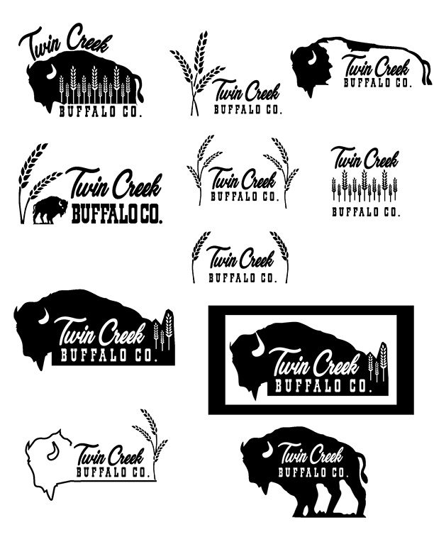
Although they did love the work, they felt that the design itself it didn’t fully capture their operation as they are primarily grain farmers still, with buffalo now currently being added to the operation as a secondary. They felt they needed to add a more distinct grain or crop element to the design.
Below is the second round of samples that explored other visual concepts that brought grain farming more into the forefront, but still incorporated the ‘Buffalo Co.’ that is in their name.

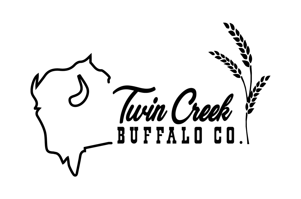
In the end, the following linework logo was chosen to represent their family operation. It is now being used for the business brand and for branded apparel.

